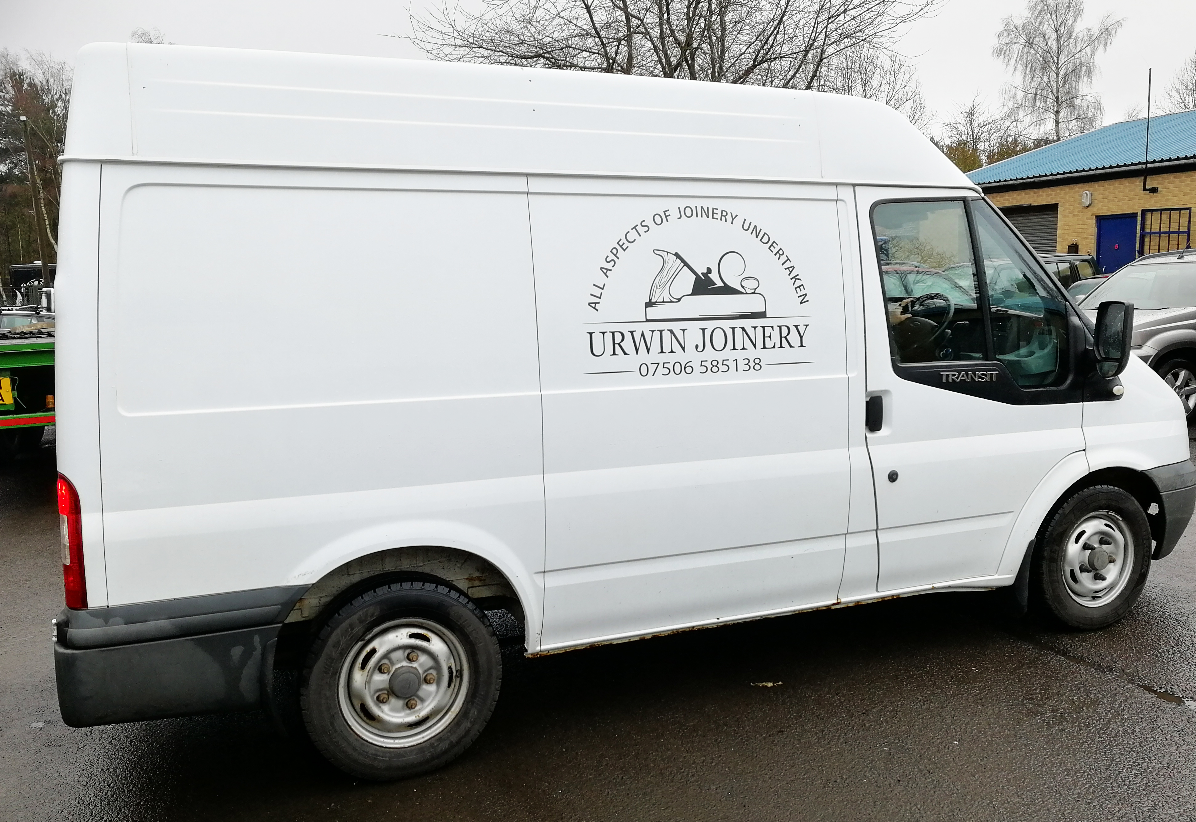
Urwin Joinery
Recently we modified a logo design for Urwin Joinery to then be applied to their van. This project is a great example of how some designs do not need to be over-complicated in order for it to stand out. Urwin Joinery’s logo is clear, simple and effective, and was applied to both sides and back of the van. We used a dark grey vinyl, which is a great contrast to the van’s colour.


